|
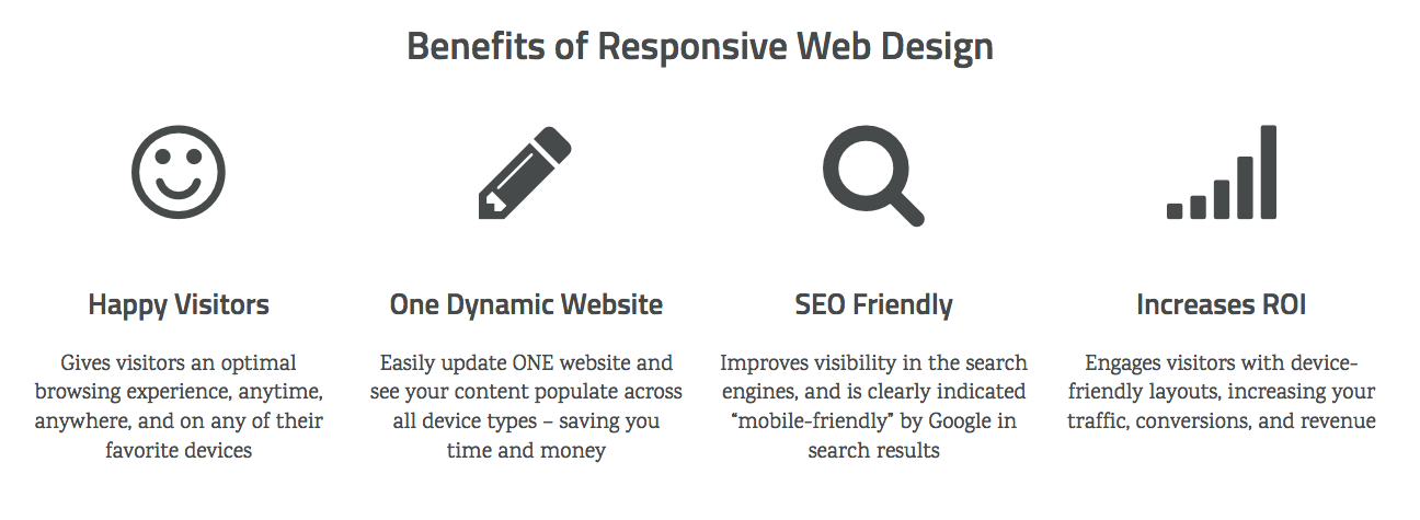
Responsive website design, also known as mobile web design, provides a unified approach to your overall digital marketing strategy. Instead of creating multiple websites to display on different devices, responsive design allows for one website to scale, move, and rearrange into multiple layout variations. Responsive sites require advanced CSS coding techniques and design principles including fluid grids, flexible image sizes, and media queries. This design style allows us to adapt layouts and content to screen sizes and orientations for a variety of devices, including smart phones, tablets, “phablets”, game consoles, TV’s, laptops, and wearables. Our responsive web design and development services include:
|